I've finished what I needed to do on the other project (of which no more news just yet). It's lovingly nestled in pretty tissue and ready for giving.
And now I'm almost ready to let the Toscana tank top sweep me away again. Of course, a tank top is beginning to seem increasingly impractical now, with the weather freshening. It's alternating between brisk autumn days and unseasonably warm ones. Soon it will make up its mind on autumn, and I'll have a definite preference for sleeves. But let the wind blow. Even so, I can still lap up those pretty colors with my eyes.
After doing my sadly needless rip-out, I knit like lightning until the back of the Crossed Laces tank top, my second of this pattern, was redone. Following the stern recommendations on the label for the hand-dyed Colinette Wigwam yarn, I dutifully alternated between two balls every two rows. I actually had not seen the necessity of that throughout the back of the tank in Toscana or the whole of the earlier tank in the Pharaoh colorway, but I followed directions, not wanting to risk a tide line. The balls seemed so well matched that I couldn't see a difference, even once I split the two sides of the neckline and knit onward up each shoulder with just its one ball of yarn, lazily omitting to wind and attach more balls to alternate. There were no noticeable differences at all.
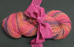
 But then I wound two more delicious balls of Toscana to knit the front, and I could finally see the point. If you look at the ball on the right, you can see it: a distinct dash of periwinkle. I had originally thought there was periwinkle in this colorway. But on looking at my sample balls and the tank-top back in progress, I said, hmmm, there's no more than the slightest hint of blue. I regretfully removed it from the description I had been writing for an earlier post, thinking my imagination had run away with me. Azalea pink and lavender, a soft bluish green and a citrus-y yellow-green, yes, but no periwinkle.
But in that last ball, finally, there it was. I hadn't imagined it, it really was there. And rather prominently, at that. I don't fully understand why this ball is different from the others; each hank is labeled with the day it was dyed, and these are all from the same days' work in the Colinette dye pots. But it's unmistakable.
I greeted it happily. It's a pretty color that I like, and it adds a little more contrast and complexity to the garden-y pink and green color scheme. And, after all, it's a lovely word, periwinkle, isn't it? A word like that can only add to the pleasure of a sympathetic colorway. (Of course, I don't claim that it would enhance every colorway. A collection of rust tones and forest green, for instance, would not necessarily benefit from its dulcet syllables. But no doubt they have wonderful words of their own.)
Having it only on the front of the tank is fine with me, too. Nobody will study the front and back to tell me they don't quite match. And if I can have periwinkle on only one side, I'm glad it's the front, where I can see and enjoy it, rather than the back where it would only be seen waving goodbye.
So the main knitting of back and front is done, and only the seaming and neck and armbands await. Uncharacteristically, I've cast on another project before getting on with the finishing. I can only say that I've just been to a fiber festival, and the lure of the new yarn is temporarily strong.
But it won't be long before I sit down to spend a lovely afternoon with Toscana. Maybe we'll have tea. In a dainty porcelain cup.

3 comments:
Oh lovely.
and wouldn't that dash of periwinkle look pretty peeping out from beneath a black velvet jacket?
I love the Toscana colorway! I like the color variety.
You're so right, Periwinkle is a wonderful word and pretty too. Nice post.
Post a Comment